
Style tab
Overview
Widget styles like background, border, font, etc. can be changed for a single and for multiple selected widgets.
If multiple widgets are selected, the properties of the main selected widget are displayed. If any of these properties are changed, these changes are applied to all other selected widgets as well.

Position / size
See chapter Widget positioning
Live mode
Specifies the widget properties Visible, Enabled and Editable in Live mode.
Remarks
In Edit mode, invisible widgets are visible as well by default (so that their properties can be changed easily). To hide invisible widgets in Edit mode as well, click on the button "Show invisible widgets in Edit mode"
 at the bottom of the widgets toolbar.
 If a table widget is disabled, cells can only be selected if they are editable. The "On click" action is in addition still active for all cells.
Type
Specifies the type of widget. In addition to the standard types Cell, Table and Menu, the following additional types are offered for these widgets:
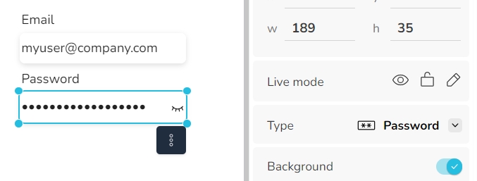
Password (for cell widgets) With this type, the content of the field is hidden. With the option to make the entered text visible and support for the browser's password manager.
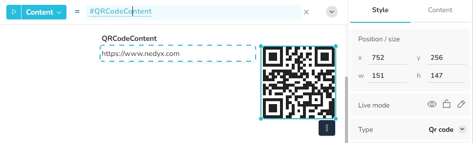
QR code (for cell widgets) The content of the cell widget is displayed as a QR code. A maximum of approx. 2,000 characters can be packed as a QR code.
Column (for table widgets) The table widget only contains a single column for this type.
Row (for table widgets) The table widget only contains a single row for this type..
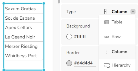
Chart widget types are described in the chapter Chart type.
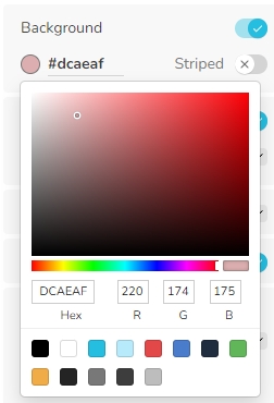
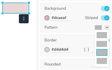
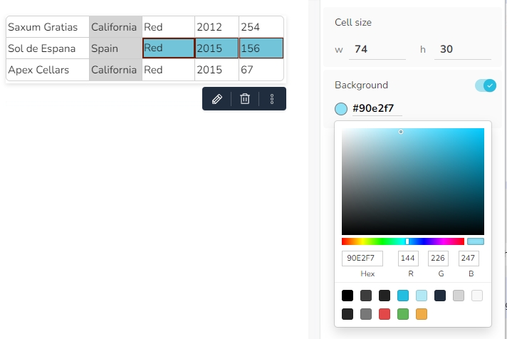
Background
Specifies the background of the widget, by a hexadecimal value representation. Clicking on the drop down icon opens a color picker for the background, with several options to select the desired color.
If the background is switched off, the widget becomes transparent, meaning widgets behind it become visible.
If the property Striped is switched on, the background color is drawn in stripes. The sub-property Pattern then specifies the direction of the stripes. The color between the stripes is white.
For table widgets, it is possible to assign the background color for the currently selected table cells.
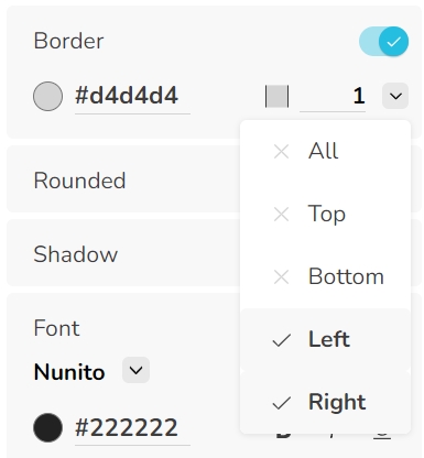
Border
Specifies the border of the widget, including the border color, position and size.
Rounded
Specifies if the corners of the widget are rounded. The number defines the radius of the rounding in pixel.
Shadow
Specifies if the widget is surrounded by a shadow.
Grid
(available only for table and chart widgets)
Specifies if gridlines are displayed. With the options to display horizontal, vertical or both lines, a color and the size of the grid lines.
Font
Defines the font of the widget. The font type can be selected from a list of fonts in the menu, with a defined size, color and type (bold, italic, underlined).
Alignment
Defines the alignment of the widget content within the widget. Alignment can be defined horizontally and vertically.
Word wrap
(available only for table, cell, menu and button widgets)
If word wrap is switched on, words which cannot be displayed in a line are wrapped to the next line.
Clear formatting
The Clear formatting option can be used to reset the formatting of a widget. The following options are available:
Clear all - Deletes all properties from the styles and settings tab of the widget.
Clear styles - Deletes all properties from the widget's Styles tab, including all cell styles of table and chart widgets.
Clear settings - Deletes all properties from the widget's Settings tab.
Last updated